Case Study
Designing a self-service portal that gave Teya's independent sales partners real-time visibility over their merchant portfolio, commissions, and performance, replacing a manual process that consumed 70% of internal team capacity.
The Problem
Teya's growth strategy in the UK depended heavily on Independent Sales Agents (ISAs), autonomous partners who onboard merchants onto Teya's payment platform and manage those relationships in exchange for commission. By 2024, scaling this channel was a strategic priority, but the infrastructure behind it was entirely manual.
Partners had zero real-time visibility over their portfolio. They couldn't see which merchants they'd onboarded, how those merchants were transacting, or what commission they were owed. Every question ("What's the status of my merchant?", "When do I get paid?") generated an email or a phone call to the partnerships team. The result was over 100 emails and 30 phone requests per week, and the manual commission process alone accounted for roughly 70% of the internal team's time.
With 40% of active partners raising complaints about transparency and the partnerships team drowning in operational work, it was clear the current model wouldn't support Teya's ambition to scale from 50 to hundreds of partners.
"I have no idea which of my merchants are actually transacting. I find out I'm owed money weeks after the fact, and even then I have to chase for it."- Independent Sales Agent, pre-portal feedback
Discovery & Research
Working with the product manager, I began by mapping the end-to-end partner journey, from onboarding their first merchant through to receiving commission payments. We conducted stakeholder interviews with the partnerships team to quantify the operational burden and spoke directly with existing ISAs to understand their frustrations and workarounds.
We also benchmarked against best-in-class partner programmes in the payments space to understand what good looked like. A consistent theme emerged: partners needed three things - visibility over their merchants, transparency on their earnings, and the ability to act on problems before they became churn.
The product requirements document identified three core pillars for V1: a merchant list with onboarding status, TPV data per merchant updated at least daily, and a "days without transacting" metric that would empower partners to proactively nudge inactive merchants.

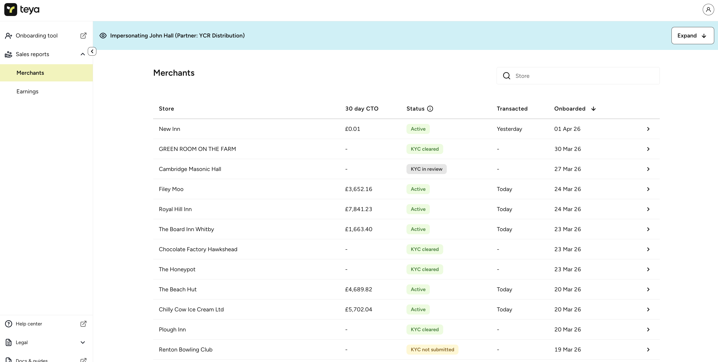
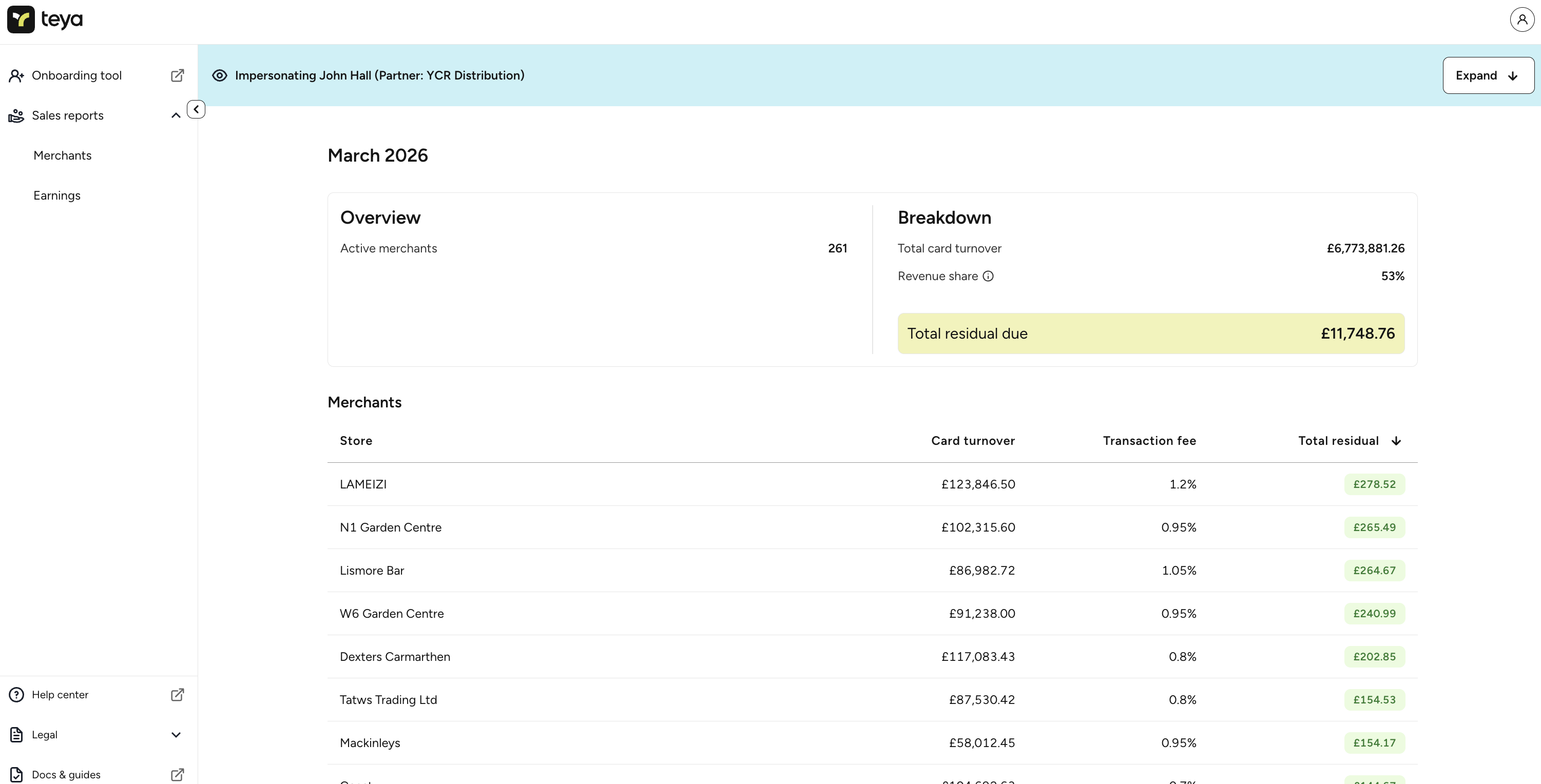
Design - Merchants View
The Merchants tab became the primary view of the portal, a filterable, searchable list showing every merchant a partner had onboarded. Each row surfaces the key information partners told us they needed at a glance: store name, 30-day card turnover, KYC status, last transaction date, and onboarding date.
The filtering system was designed as a critical retention tool. Partners can quickly identify merchants who haven't started transacting yet, or who have stopped. This shifts the partner's role from passive to proactive, they can reach out to a newly onboarded merchant who hasn't activated, or get in front of issues with an existing merchant before they churn. The status indicators (Active, KYC cleared, KYC in review, KYC not submitted) give immediate visibility into the onboarding pipeline.
This single feature transformed partner behaviour. Average merchant activation time dropped from 17 days to 5 days because partners could now see exactly who needed a follow-up call.
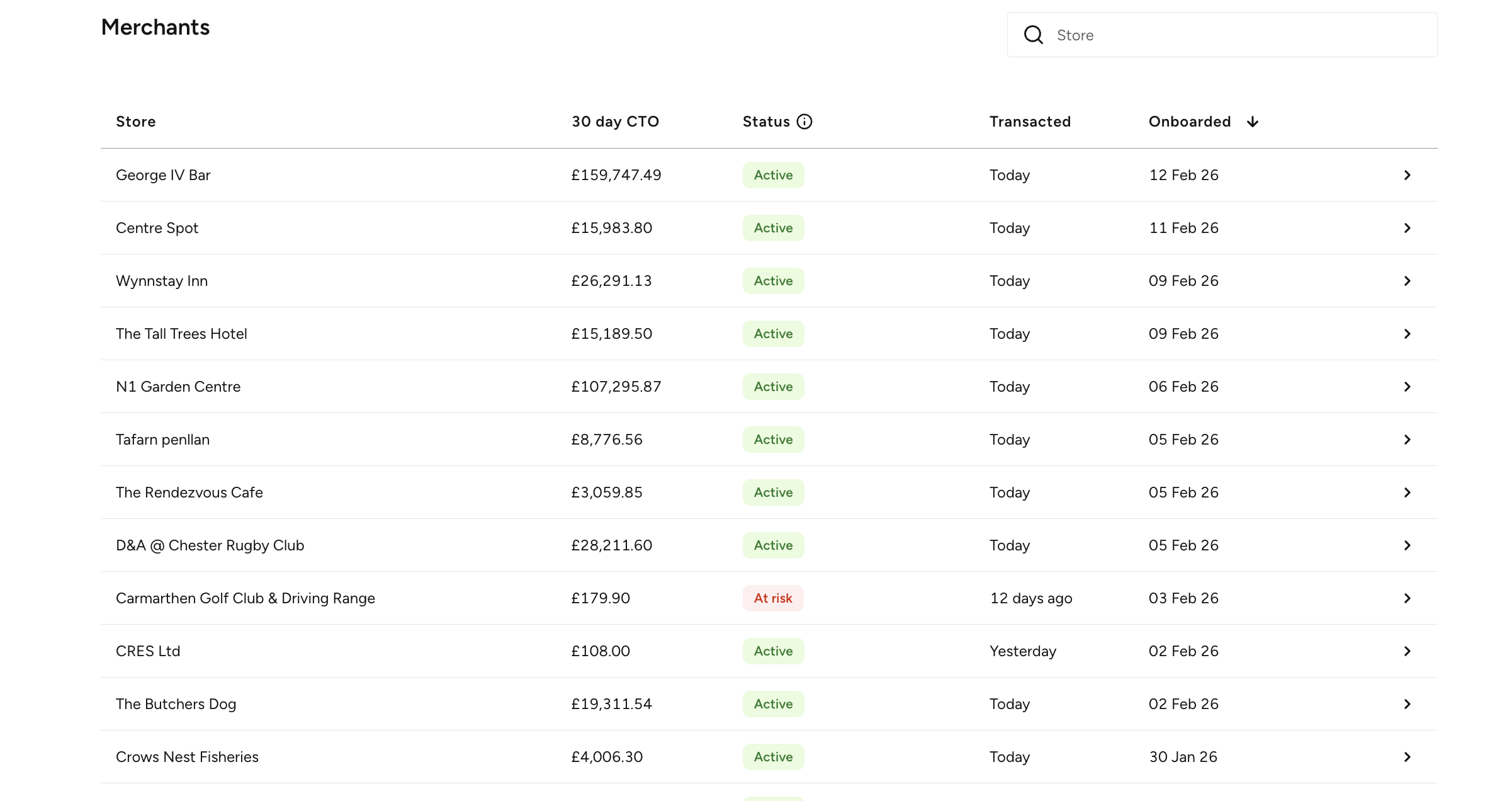
The Merchants tab gives partners a real-time view of every merchant they've onboarded, with filtering by status to surface those needing attention.
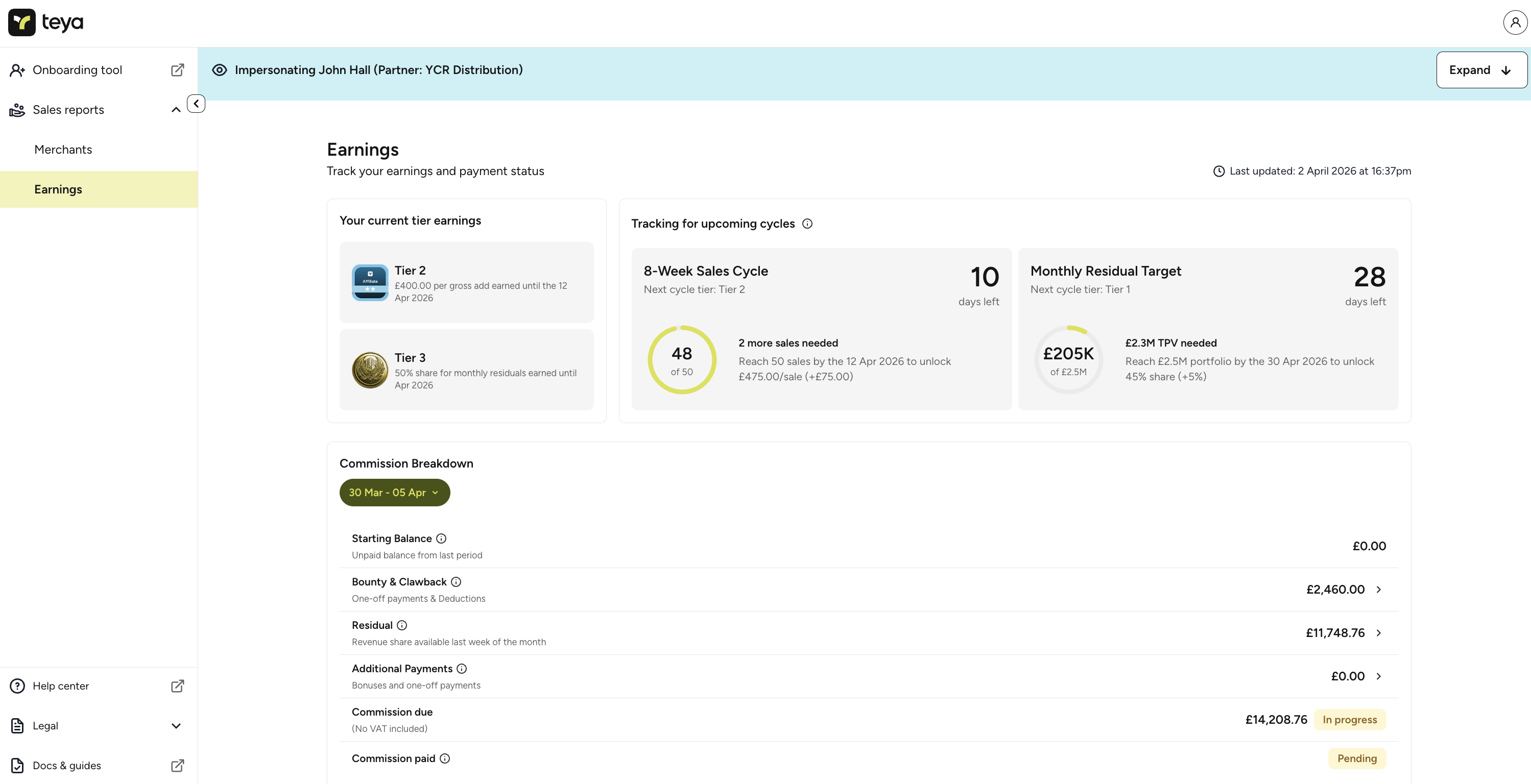
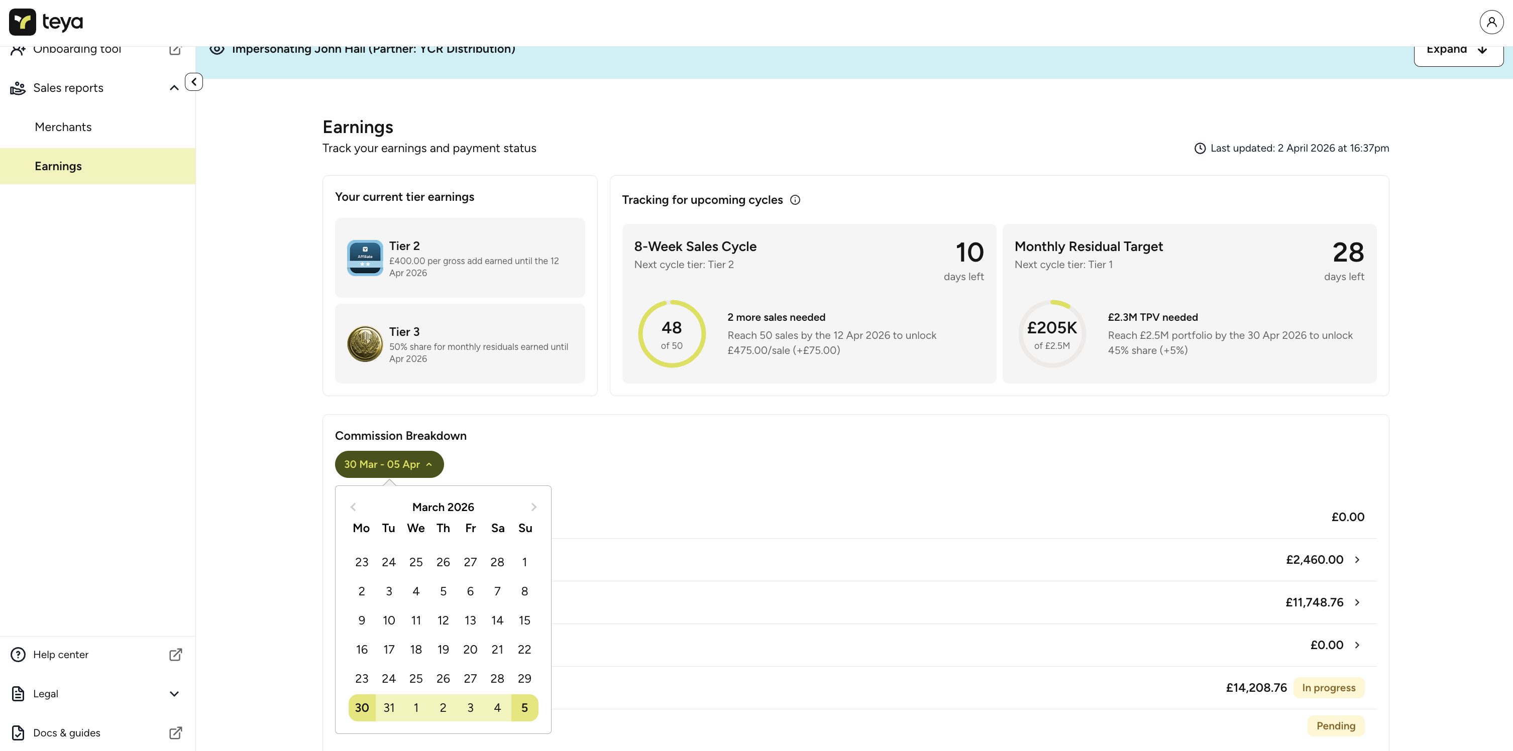
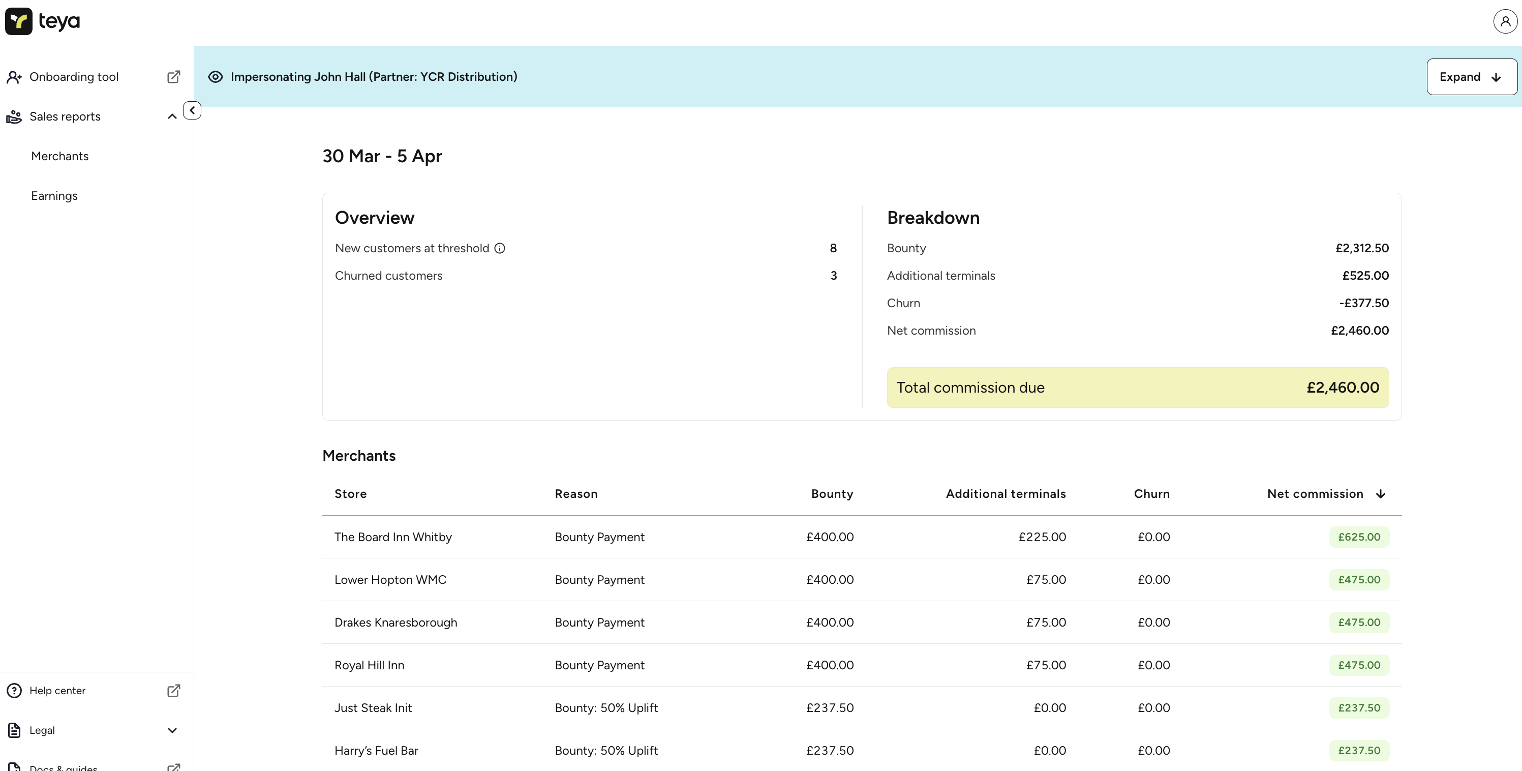
Design - Commissions & Earnings
The Earnings page was designed to solve two problems at once: give partners complete transparency on what they're owed, and gamify the earning experience to drive more sales. The interface shows current tier status, progress toward the next commission tier, and a countdown of how many sales or how much TPV is needed to unlock higher rates.
The tier tracking cards (showing the 8-week sales cycle and monthly residual target) were deliberately designed to create a sense of momentum. A partner can see they need just 2 more sales in the next 10 days to unlock a higher bounty rate, or that they're 82% of the way to a better revenue share. This turned commission from a passive payout into an active motivator.
Below the tier tracking, the Commission Breakdown provides a weekly or monthly view showing starting balance, bounty and clawback amounts, residual earnings, and additional payments, with clear status labels (In progress, Pending, Paid) so partners always know exactly where their money is. This was critical for Teya: it reduced commission-related calls by 34%.
Design - Commission Detail
Drilling into the commission detail, partners can see exactly how much revenue each individual merchant has generated: card turnover, transaction fee percentage, and their total residual per store. The Bounty & Clawback view separately breaks down new customer payments, additional terminal fees, and churn deductions, giving partners a complete picture of their net commission.
This level of granularity was important because the commission structure is tiered and variable, it depends on TPV thresholds, card types, and merchant activity. Previously, partners had to trust a spreadsheet they received once a month. Now they can verify every line item in real time, which built trust in the programme and significantly reduced disputes.
"The tier tracking changed everything. I can see exactly how many more sales I need to hit the next level - it makes me want to push for it."- Partner feedback, post-launch
Impact & Scale
The Partner Portal wasn't just a feature, it was the infrastructure that unlocked Teya's partner channel as a scalable growth engine. Before the portal, managing 50 partners required constant manual intervention from the partnerships team. Eighteen months after launch, the same team was supporting 600 partners and over 5,500 merchants processed monthly through the tool.
The filtering and visibility features drove a 1% per month reduction in merchant churn, as partners could now proactively identify and address issues with inactive merchants. The commission transparency, with its real-time status tracking, cut commission-related phone calls and emails by 34%, freeing the internal team to focus on strategic partner growth rather than operational firefighting.
The gamification of the tier system drove a measurable increase in partner effort. By showing partners exactly how close they were to higher commission rates and countdown timers to the next evaluation cycle, we turned what had been a passive incentive into an active motivator. Average sales per partner per month increased from 4.1 to 7.5, as partners pushed to onboard more merchants and ensure existing ones kept transacting.
Reflection
This project reinforced that the most impactful design work often isn't about aesthetics, it's about giving the right people the right information at the right time. The portal's power came from surfacing data that already existed but was locked behind manual processes and spreadsheets. By making it accessible and actionable, we changed partner behaviour without requiring a single training session.
Working closely with the product manager and engineering team across an 18-month iterative build also taught me the value of shipping in phases. V1 focused on the merchant list and basic commission visibility, just enough to prove value and build trust with partners. Each subsequent release added depth (tier tracking, commission breakdowns, payment status) based on partner feedback and usage data. Trying to ship everything at once would have delayed launch by months and missed the window to retain partners who were already frustrated.
If I were to revisit this, I'd push for user research earlier in the commission design phase. We designed the tier gamification based on internal assumptions about what would motivate partners. It worked, but I suspect we could have made it even more effective if we'd tested different motivational frameworks with real partners before committing to the design.