Case Study
A mixed-methods usability study of the Diabetes UK One Million Step Challenge microsite, combining task-based observation with standardised questionnaires to uncover 22 usability issues (10 rated catastrophic) and deliver actionable recommendations to the charity's digital team.
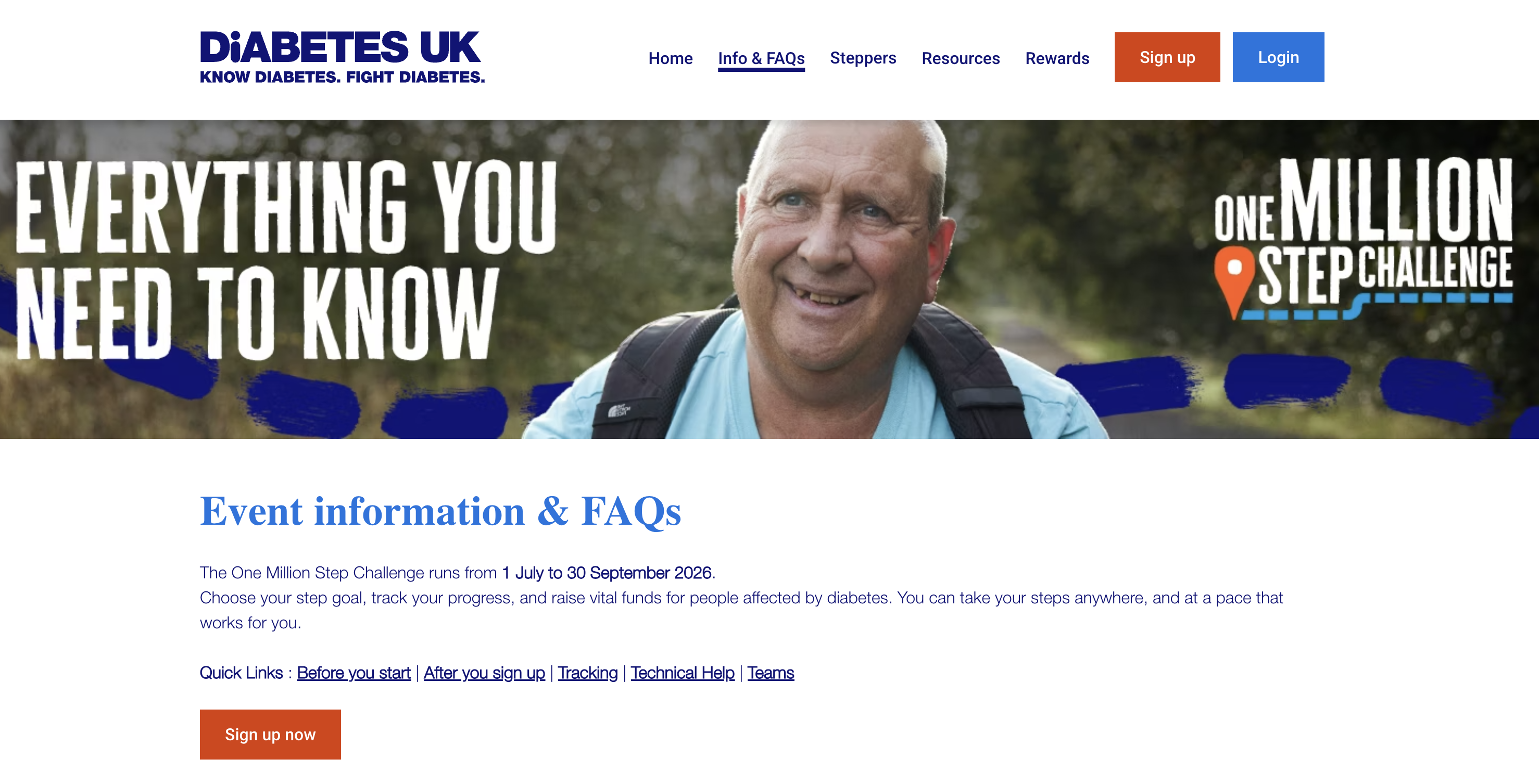
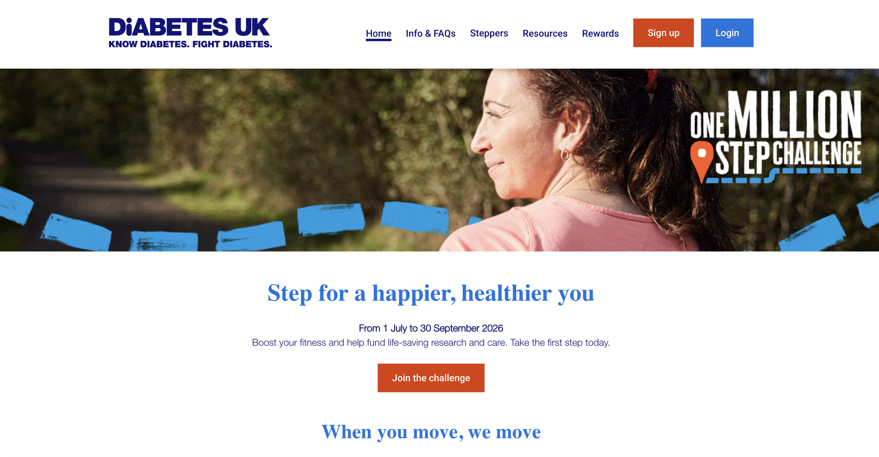
The OMS Challenge homepage (left) and Info & FAQs page (right), the two primary entry points evaluated in the study.
Background
Diabetes UK's One Million Step (OMS) Challenge is a fundraising initiative that encourages participants to walk one million steps over the course of a year to raise money for diabetes research and support. The challenge runs as a microsite hosted on the charity's main domain, and participants use it to sign up, track their progress, form teams, and share journal updates.
Diabetes UK approached us to evaluate the usability of the OMS microsite before a planned redesign. They had observed high drop-off rates during registration and low engagement with social features like team invitations and story updates, but lacked structured research to explain why. Our brief was to identify the specific usability barriers causing these problems and provide prioritised, evidence-based recommendations for improvement.
This was a real client engagement: the findings were delivered directly to the Diabetes UK digital team for use in their upcoming redesign sprint.
Methodology
The study used a mixed-methods design that combined qualitative observation with three standardised quantitative instruments. Six participants were recruited based on demographic alignment with OMS's target audience: adults aged 25–65, comfortable with basic web browsing, and not already participating in the challenge.
Each participant completed eight tasks that followed the core user journey of the microsite: navigating from the Diabetes UK homepage to the OMS challenge page, finding key information, signing up, creating a team, inviting friends, updating their team story, posting a journal entry, and connecting a Fitbit device.
After each task, participants rated difficulty using the Single Ease Question (SEQ), a 7-point Likert scale validated for single-task assessments. After all tasks, they completed both the Post-Study System Usability Questionnaire (PSSUQ) and the User Experience Questionnaire (UEQ) to capture broader impressions of system usability and user experience.
All qualitative observations were synthesised using a rainbow spreadsheet, a method where each participant is assigned a colour and their individual observations, quotes, and behaviours are mapped against each task. This technique made it possible to visually identify patterns: where multiple colours cluster around the same issue, it signals a systemic problem rather than an individual anomaly.
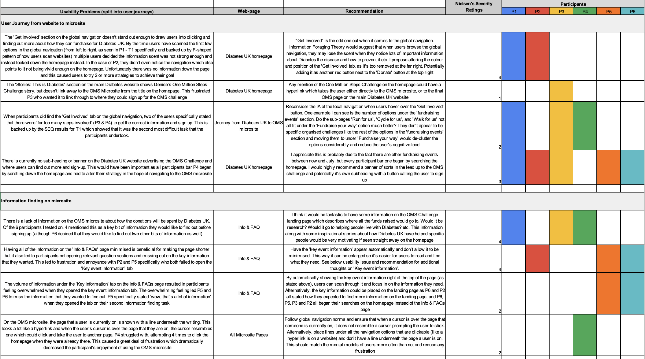
The rainbow spreadsheet maps each participant's observations by colour, making it easy to spot where multiple users hit the same barrier.
Quantitative Findings
The overall task completion rate was 64.5%, well below the 78% industry benchmark established by the Baymard Institute. Only one task (posting a journal update) achieved 100% completion. Two tasks - signing up for the challenge and inviting friends to a team - had completion rates of just 16.7%, and updating the team story had a 0% completion rate due to a critical redirect bug.
SEQ scores averaged 4.84 across all tasks (on a scale where 1 = easy and 7 = difficult), compared to a benchmark median of 5.5. Tasks 4 and 6 - signing up and updating the team story - scored highest for difficulty at 6.1 and 5.8 respectively, confirming the quantitative signal from the completion data.

Task completion rates (left) and Single Ease Question difficulty scores (right) across all eight evaluation tasks.
Qualitative Analysis
The rainbow spreadsheet analysis surfaced 22 distinct usability issues across the eight tasks. These were classified using Nielsen's severity rating scale, which weighs frequency, impact, and persistence. Of the 22 issues, 10 were rated catastrophic (severity 4), meaning they represented fundamental barriers that prevented users from completing their goals.
The sign-up flow was the single biggest pain point. Four of the six participants encountered issues during registration, with problems ranging from confusion about whether to "sign up" or "log in", to a multi-step authentication process that redirected users away from the microsite entirely. One participant failed to complete sign-up at all. The team invitation flow was similarly broken: users struggled to find the invite mechanism and were confused by how the team structure related to the challenge itself.
The most severe individual issue was the team story update page, which had a 100% failure rate. Every participant who attempted to update their team story was redirected to a different page due to a navigation bug, a catastrophic issue that the Diabetes UK team had not previously identified.

22 issues mapped by journey stage and Nielsen severity level - sign-up and team story had the highest concentration of catastrophic issues.
"I genuinely don't know if I'm signing up or logging in. It keeps sending me to different pages and I've lost track of where I started."- Participant 3, during sign-up task
Experience Benchmarking
The UEQ results benchmarked the OMS microsite against a dataset of 468 product evaluations. Four of the six UEQ dimensions (attractiveness, efficiency, dependability, and stimulation) scored "below average", while perspicuity and novelty scored in the "bad" category. The microsite failed to meet the benchmark on any single dimension.
The PSSUQ results told a similar story. System usefulness scored 3.17 against a benchmark of 2.80 (on a scale where lower is better), and information quality scored 3.22 versus 3.02. Only interface quality (2.50 vs. 2.49) was roughly in line with the industry benchmark. Together, the standardised instruments confirmed the qualitative findings: the microsite had fundamental usability problems that affected both task performance and overall user perception.

UEQ benchmark comparison (top) and PSSUQ industry comparison (bottom) - the microsite scored below average or bad across every measured dimension.
Recommendations
Based on the severity ratings and the frequency of impact across participants, we prioritised four recommendations for the Diabetes UK digital team. Each recommendation was linked directly to specific issues from the rainbow spreadsheet and supported by both the qualitative and quantitative evidence.
Priority 1
Consolidate the fragmented authentication process into a single, linear flow within the microsite. Remove the redirect to an external authentication page and provide clear visual distinction between sign-up and log-in paths.
Priority 2
Resolve the critical redirect issue that prevents 100% of users from updating their team story. This is a zero-completion-rate task caused by a navigation error, a quick fix with immediate impact.
Priority 3
Make the primary call-to-action on the Diabetes UK homepage more visually prominent. Four of six participants failed to find the OMS challenge entry point in the current layout. Consider above-the-fold placement or a dedicated banner.
Priority 4
Redesign the team invitation mechanism to reduce cognitive load. Current flow requires users to navigate between multiple pages, so replace with an inline invite form or shareable link accessible directly from the team dashboard.
Reflection
This project cemented my belief in the power of combining qualitative and quantitative methods. The numbers alone (64.5% completion, 4.84 SEQ) told us there was a problem, but they couldn't explain why. The rainbow spreadsheet brought the why to life: it showed exactly which users hit which barriers, and where individual anomalies became systemic patterns. Presenting both together made the case for change far more compelling to the Diabetes UK team than either alone.
The study also reinforced the value of standardised instruments as a credibility tool. Using SEQ, PSSUQ, and UEQ gave us externally validated benchmarks to reference, which mattered when delivering findings to a client stakeholder team who weren't UX specialists. Saying "the sign-up flow has a 16.7% completion rate" is impactful; saying "it scores worse than 468 comparable products on perspicuity" adds a layer of authority that drives action.
If I were to run this study again, I'd increase the participant count to strengthen the quantitative reliability of the findings. Six participants were sufficient for uncovering the core usability issues (consistent with Nielsen's heuristic), but a larger sample would have produced tighter confidence intervals on the SEQ and UEQ scores, making the benchmark comparisons even more defensible.